So keeping in mind what 'feel' I want tp create and bearing in mind that this is a CD cover which needs to sell the recording, I've opted for one of the original images from last year; one with no people, as a starting point for the composition. This will introduce changes into the original 'real' image using 'real' images taken at the same time and a year later in the same subway....Will this be a justifiable interpretation? I believe so but will return and answer to this question more fully later. I shall play around with a few compositions and see what strikes a chord and best matches my aim here.I'm also keeping in mind the need to have some space within the composition for the CD title etc.
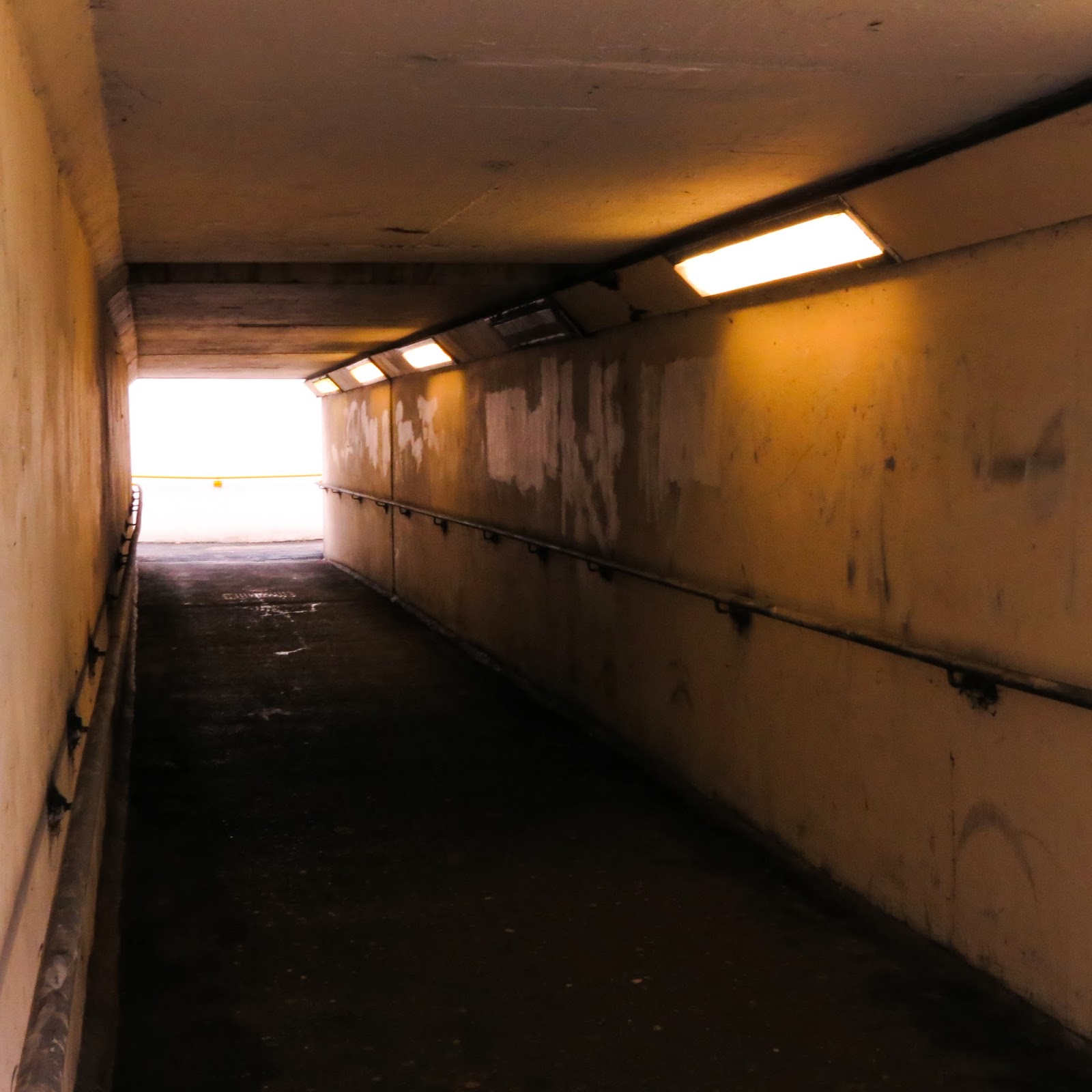
Starting with P626, chosen for the compositional opportunities offered by the angle of the tunnel. I increased the exposure, contrast and saturation of the original image to create a more defined yellow colour to emphasize the artificial lighting..
.jpg) |
| P626 |
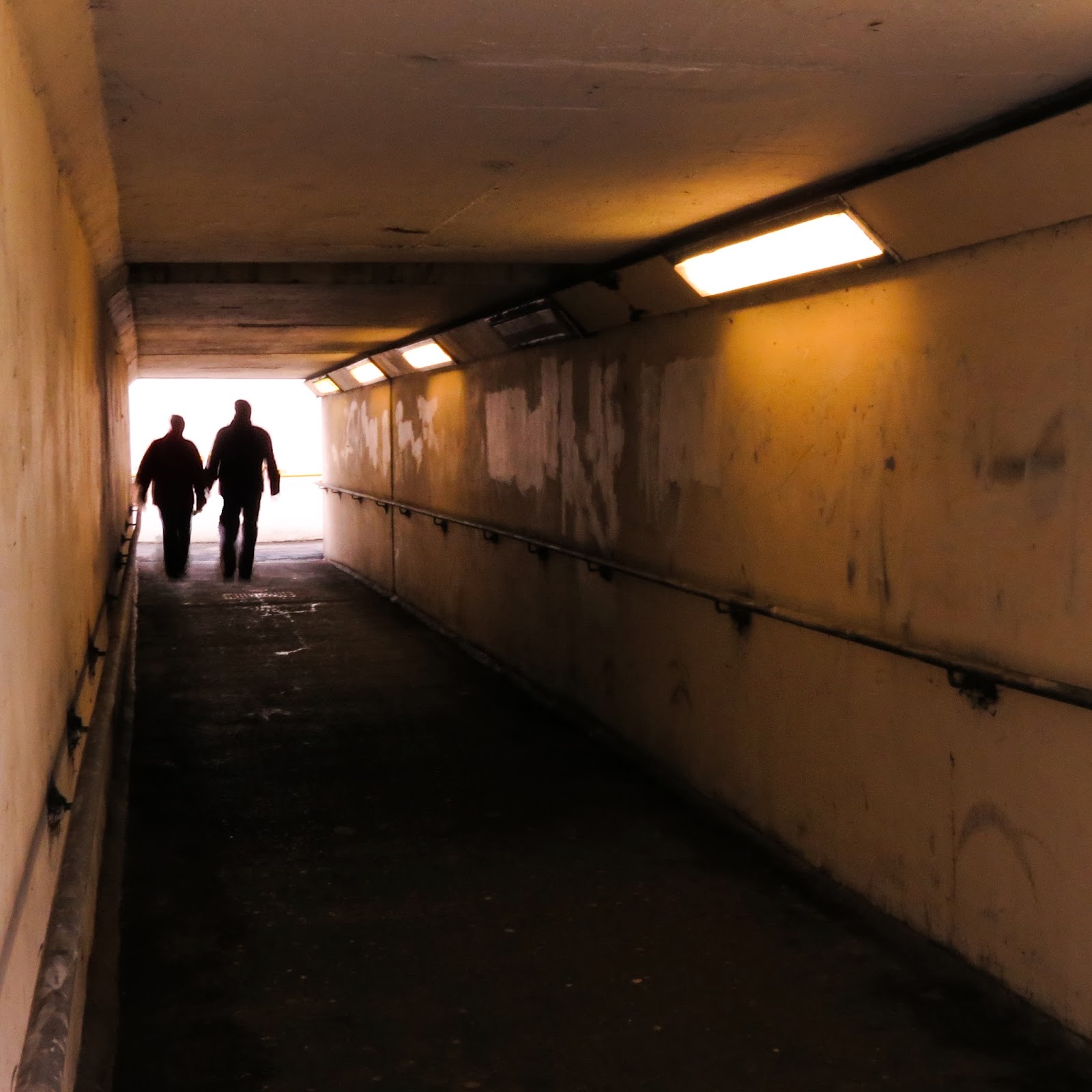
Using Photoshop Elements 10 (Magic extractor), I took two silhouetted figures from a photo taken at the same time with a different, narrower tunnel angle and added them in to create P627. I wanted to show figures in motion since the theme is about 'people' returning from the dead.
 |
| P627 |
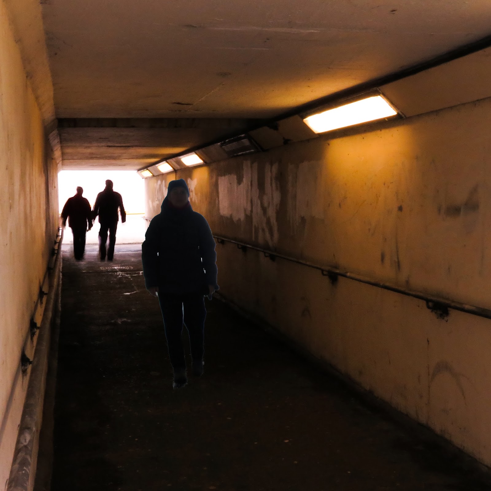
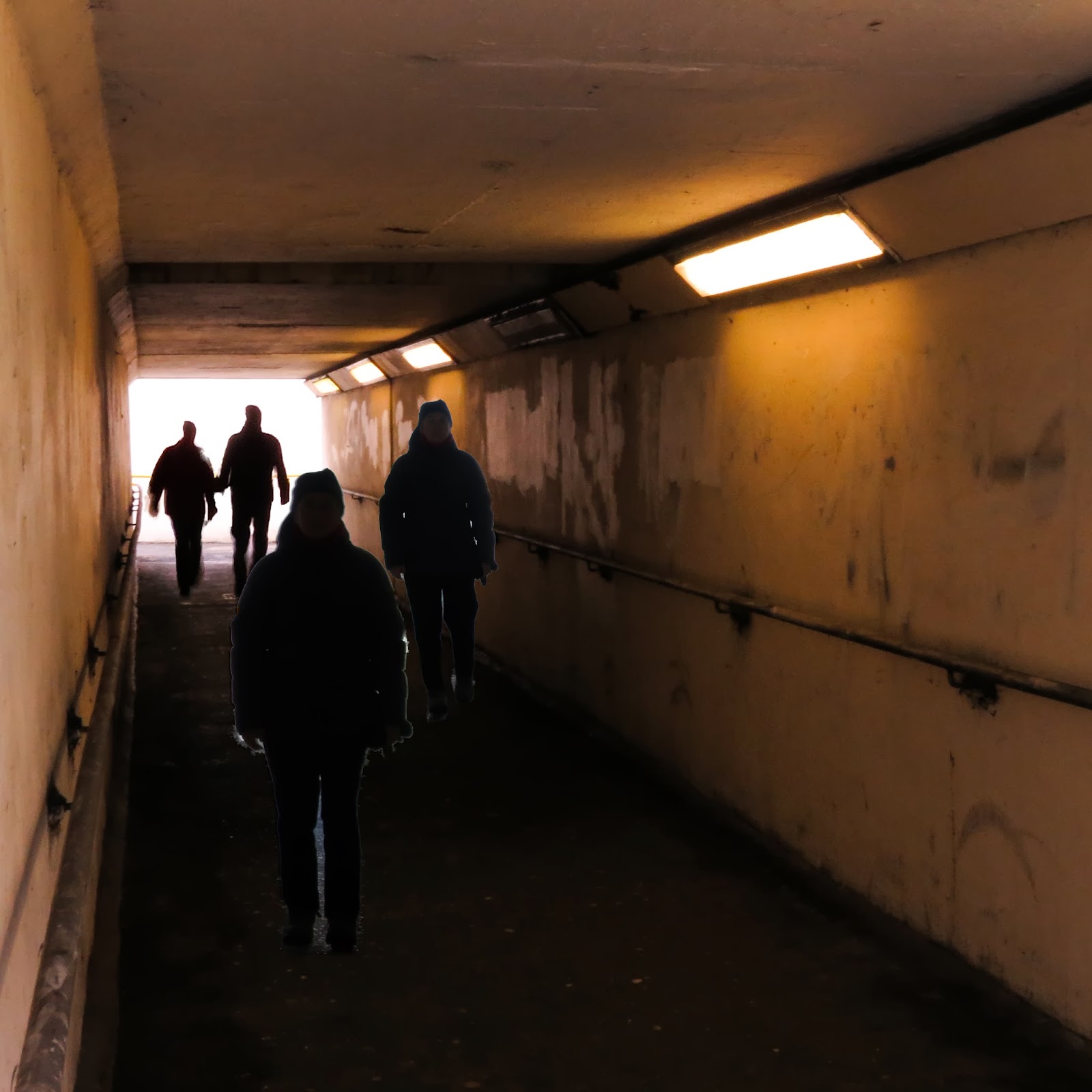
Next step ..this time I went to the actual images taken for this assignment i.e the ones using the 'willing' model.Using the same Photoshop tool, I chose one silhouette again showing motion for P628 and then added in a fourth image for P629 ( one at standstill to suggest menace).
 |
| P628 |
 |
| P629 |
Looking at these later images, I'm going to go for P628 as i think this looks the most menacing.
.jpg)


No comments:
Post a Comment