.jpg) |
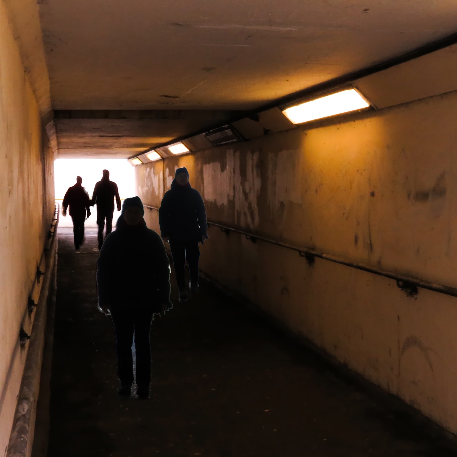
| 'The Returned' CD cover |
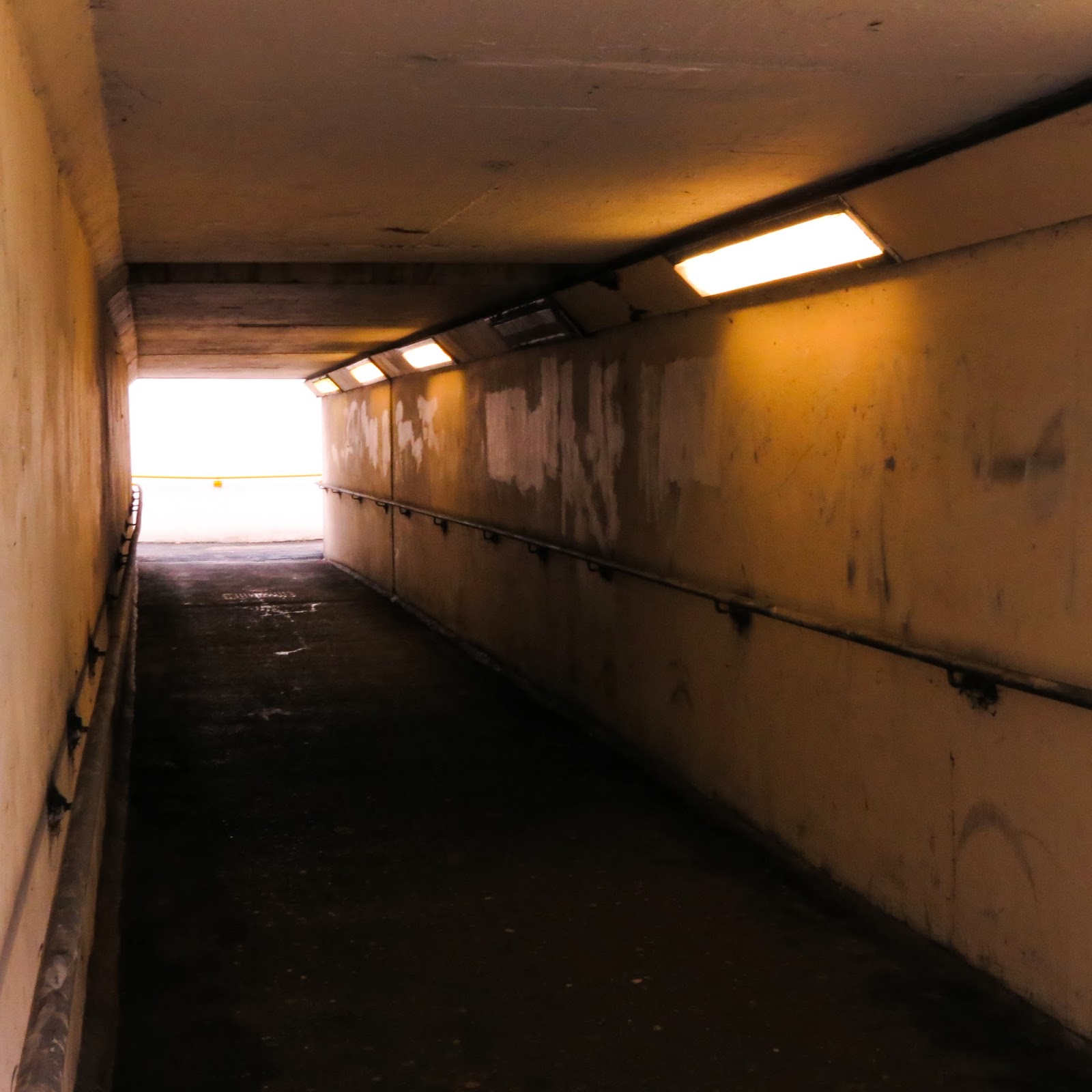
This CD cover is my submission for Assignment 4. I arrived here following two separate strands of thought- the idea for this CD cover and a concept for a paperback dust jacket for 'Servants' written by Lucy Lethbridge which I had just read and which had struck a very personal note for me.Both were interesting to pursue, so much so, that I took both forward to completion before deciding which one to send in as the assignment. Each idea was technically challenging in its own way and threw up a number of ethical issues en route.
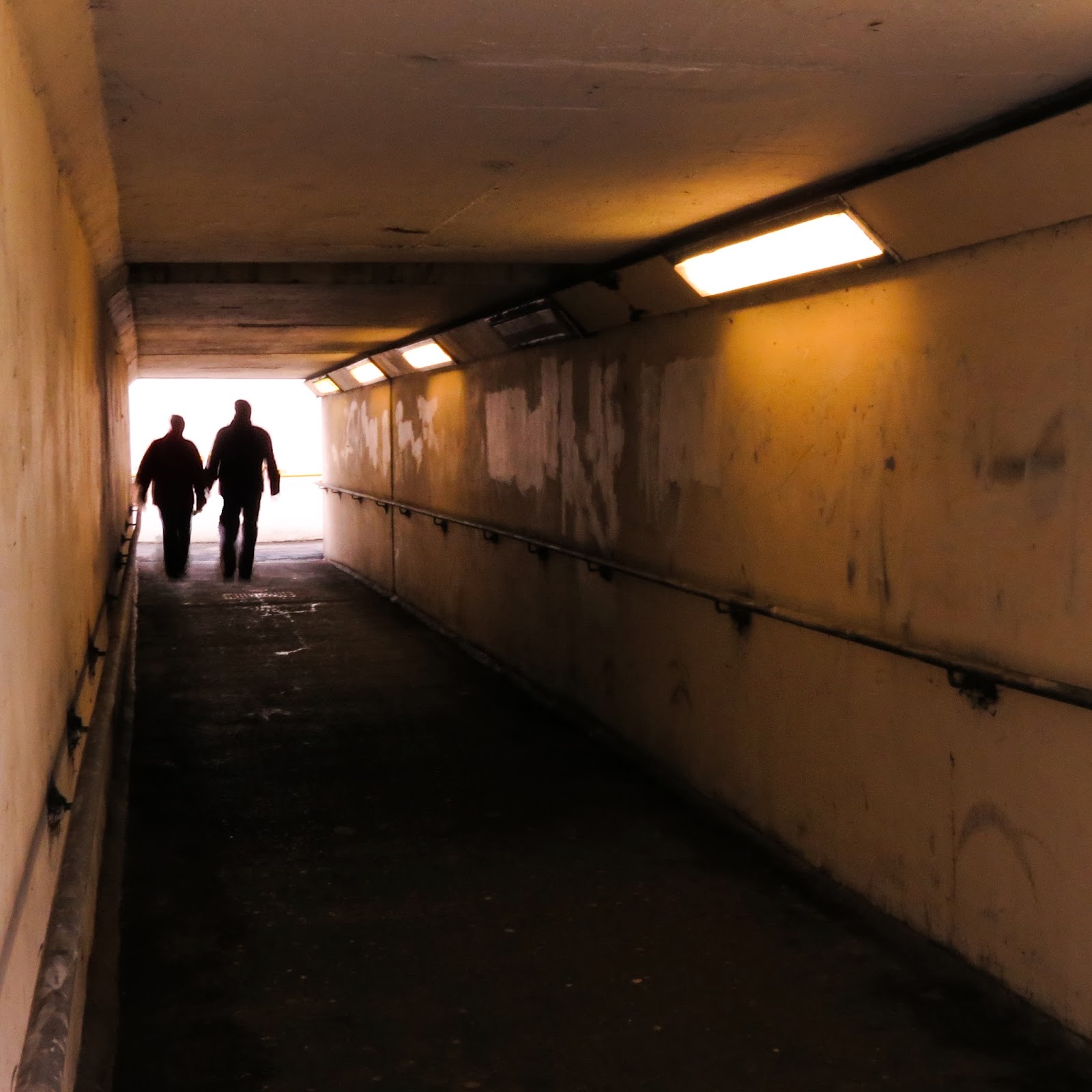
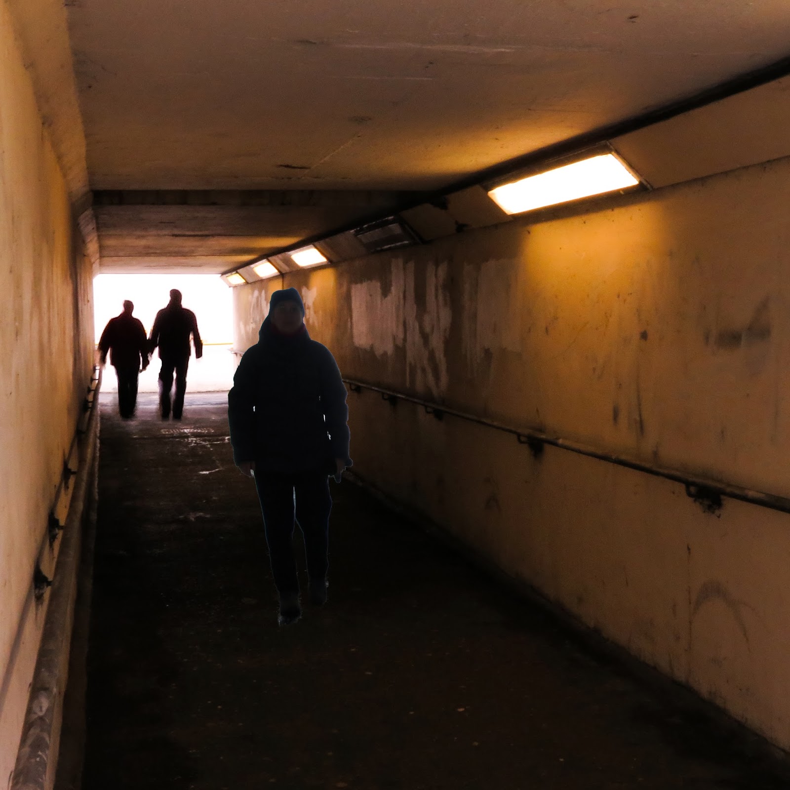
I used a number of images for the CD cover.I took them a year apart but in the same place- a local pedestrian subway. The subway and figures are real but I manipulated the composition to achieve the composition, colour and 'atmosphere' and using Photoshop Elements and Lightroom software. The starting point was an empty subway which I 'peopled' with images taken from the other photos.
So real images used to fake a scene representing a fictional situation in a fictional supernatural television series. The urban setting is recognisable and gives the scene credibility but software processing has been used to change the image into a more menacing situation.
I think that I am more comfortable with these changes in that the Cd cover is intended as an illustration - an interpretation of a 'fictional' situation. It is not intended to convey or pass as a real situation. If we can go by just the intention here then perhaps this can be justified in ethical terms. But if we add in what interpretation people take away from the image not knowing this is a 'madeup' scene, perhaps thinking this is one of the city subways you would not choose to go down given its menacing 'feel', then this becomes less clear cut.
And turning to my 'runner-up dust jacket..

Firstly, the image of the girl looking out at us, my grandmother, that I used was taken by another, unknown, photographer who cannot be credited. Given the age of this photo, can we assume it is out of copyright? Yes, I think so as copyright for photographs lasts for 70 years pma or 70 years after the work was first made available if the author is unknown.
While the image of the girl looks and is 'real', the overall photographic image is very obviously not real given the timescale discrepancy between the 'Edwardian dress ' and the items on table. So I can justify what I have used in the 'image' ? Yes, but I know that I have altered the Edwardian dress to provide a fuller skirt - is this justifiable in ethical terms as it is not obvious? Does it change anything other than help the compositional perspective? Does it alter the meaning intended i.e. how far cleaning and society has come since the girl standing sedately for her photograph spent her days as cleaning as a general servant. I think not.On balance I think I can justify this composition and changes made in ethical terms.


.jpg)
.jpg)
.jpg)
.jpg)


.jpg)
.jpg)

.jpg)

